-
Styling the AlertDialog like Material Theme
about 11 years ago
By the help of Supporting library we can show the AlertDialog like we have in Lollipop on below version. For this you need to import AlertDialog from
import android.support.v7.app.AlertDialog;
And then show a AlertDialog like we do normally:-
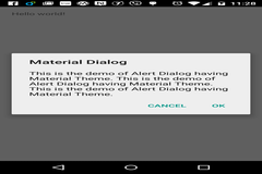
AlertDialog.Builder builder = new AlertDialog.Builder(this);
        builder.setTitle("Material Dialog");
        builder.setMessage("This is the demo of Alert Dialog having Material Theme. This is the demo of Alert Dialog having Material Theme. This is the demo of Alert Dialog having Material Theme." +
                "");
        builder.setPositiveButton("OK", null);
        builder.setNegativeButton("Cancel",null);
        builder.show();
The AlertDialog will show like this:-
You can also modify the style like this:-
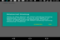
<style name="MyAlertDialogStyle" parent="Theme.AppCompat.Light.Dialog.Alert">
        <item name="colorAccent">#FFCC00</item>
        <item name="android:textColorPrimary">#FFFFFF</item>
        <item name="android:background">#009788</item>
  </style>
and then initialize the AlertDialog with theme as below:-
  AlertDialog.Builder builder = new AlertDialog.Builder(this, R.style.MyAlertDialogStyle);
        builder.setTitle("Material Dialog");
        builder.setMessage("This is the demo of Alert Dialog having Material Theme. This is the demo of Alert Dialog having Material Theme. This is the demo of Alert Dialog having Material Theme." +
                "");
        builder.setPositiveButton("OK", null);
        builder.setNegativeButton("Cancel",null);
        builder.show();
Now the AlertDialog will show like this:-


0 Comment(s)