-
Best 5 CSS Grid Layout Frameworks Web Designers Should Use
about 9 years ago
Frontend CSS frameworks ordinarily comprise of a bundle of a structure of records and organizers of institutionalized code (HTML, CSS, JS documents etc.)
The standard segments are:
- CSS source code to make a framework: this enables the developer to position the different elements that make up the site plan in a straightforward and adaptable form.
- Typography style definitions for HTML components.
- Solutions for cases of browser incompatibility so the site displays correctly in all browsers.
- Formation of standard CSS classes which can be utilised to style propelled segments of the UI.
Before begin continuing with this tutorial exercise, we are accepting that you are as of now aware about the essentials of HTML and CSS. Just In case, if you are not very much aware of these ideas then I would suggest you to first practice short instructional exercise on HTML Tutorial and CSS Tutorial.
The following are the rundown of main 5 Front-end css structures for 2016-17, which are exceptionally favoured by the software industry:-
1. Bootstrap
Bootstrap is the popular CSS front-end framework in the present time. It is smooth, natural, and capable mobile first front-end CSS system for faster and simpler site improvement. It utilizes HTML, CSS and Javascript.
Bootstrap is more prominent for another front-end designer. Most components can be use without essential information of JavaScript.
Browser support:-Bootstrap is supported by all popular and major browsers i.e: Chrome, Firefox, IE and Safari.
Download Bootstrap:-
You can download the latest version of Bootstrap package from here.HTML template:-
A basic HTML template using Bootstrap would look like this:-<!DOCTYPE html> <html> <head> <title>Bootstrap Template</title> <meta name="viewport" content="width=device-width, initialscale=1.0"> <!-- Bootstrap --> <link href="css/bootstrap.min.css" rel="stylesheet"> <!-- HTML5 Shim and Respond.js IE8 support of HTML5 elements and media queries --> <!-- WARNING: Respond.js doesn't work if you view the page via file:// --> <!--[if lt IE 9]> <script src="https://oss.maxcdn.com/libs/html5shiv/3.7.0/html5shiv.js"></script> <script src="https://oss.maxcdn. </head>com/libs/respond.js/1.3.0/respond.min.js"></script> <![endif]--> <body> <h1>Twitter Bootstrap</h1> <!-- jQuery (necessary for Bootstrap's JavaScript plugins) --> <script src="https://code.jquery.com/jquery.js"></script> <!-- Include all compiled plugins (below), or include individual files as needed --> <script src="js/bootstrap.min.js"></script> </body> </html>What is Bootstrap Grid System?
Twitter Bootstrap incorporates a responsive, mobile first liquid grid framework that suitably scales up to 12 columns as the gadget or viewport measure increments. It incorporates predefined classes for simple design choices, and intense mixins for producing more semantic formats. Give us a chance to comprehend the above articulation. Bootstrap 3 is mobile first as in the code for Bootstrap now begins by targeting smaller screens like mobile devices, tablets, and after that "extends" parts and networks for bigger screens, for example, portable PCs, desktops.
For example how to use classes for Mobile, tablet, desktop view:-
<div class="container">
 <div class="row">
   <div class="col-xs-6 col-sm-3 col-md-6 col-lg-4">....</div>
   <div class="col-xs-6 col-sm-3 col-md-6 col-lg-4">....</div>
 </div>
</div>
2. Semantic-UI
Semantic UI is an all around created front-end structure with expert elements and a vigorous API. This course will manage us from beginning to end through the way toward building a four-page site with an extensive variety of (UI) components, utilizing Semantic UI.
Semantic UI is 16 Columns base structure. It enables the developers to construct responsive sites quickly, with brief HTML coding, instinctive javascript, and simplified troubleshooting, making front-end improvement a delightful affair.Semantic framework is responsive which helps website to scale and fit on different devices. Semantic is generation prepared and collaborated with systems, for example, React, Angular, Meteor, and Ember, which you can incorporate it with any of these structures to compose our UI layer close by our application rationale.
For more details on setup visit here.
Key Features of Semantic-UI
- 50+ UI elements
- 3000 + CSS variables
- 3 Levels of variable inheritance (similar to SublimeText)
- Built with EM values for responsive design
- Flexbox friendly
Below example will describe, how to use classes for grid system:-
<div class="ui page grid">
  <div class="four wide column">four wide column</div>
  <div class="four wide column">four wide column</div>
  <div class="four wide column">four wide column</div>
  <div class="four wide column">four wide column</div>
  <div class="four wide column">four wide column</div>
  <div class="four wide column">four wide column</div>
  <div class="four wide column">four wide column</div>
  <div class="four wide column">four wide column</div>
</div>
3. Foundation

Foundation is known to be one among the advanced front-end frameworks for planning stunning responsive websites. It works on all types of devices and provides us with HTML, CSS and JavaScript plugin.It could be a front-end framework consisting of the many Pre-built UI components which are helpful for creating unique designs of websites. Primarily designed with HTML, CSS and jQuery, Foundation involves the use modern technologies and practices. Although the framework is most typically used by HTML and CSS developers, we have the option of taking things further using Foundation in conjunction with Sass and Rails.
For more details on setup visit here.
Key Features of Foundation:-
- Easier to take care of code with snippets and libraries
- Most are free and open source
- Usually the ability to contribute on Github
- Get regular updates, bug fixes, and new feature
- A lot of organized and simple to setup
HTML template:-
Foundation css framework basic HTML template would look like this:
<!doctype html>
<html>
  <head>
    <!-- your site information -->
    <link rel="stylesheet" href="css/foundation.css" />
    <link rel="stylesheet" href="css/app.css" />
  </head>
  <body>
    <!-- your content -->
    <script src="js/vendor/jquery.min.js"></script>
    <script src="js/vendor/what-input.min.js"></script>
    <script src="js/foundation.min.js"></script>
    <script src="js/app.js"></script>
  </body>
</html>
Note: Foundation is mobile-first css framework. This code is for small screens first like: mobile and pill (tablet), and larger devices can inherit those styles. Customization can be done for larger screens as necessary.
For example how to use classes for grid system layout:-
<div class="row">
  <div class="small-2 large-4 columns">Small 2 columns Large 4 columns</div>
  <div class="small-4 large-4 columns">Small 4 columns Large 4 columns</div>
  <div class="small-6 large-4 columns">Small 6 columns Large 4 columns</div>
</div>
<div class="row">
  <div class="large-3 columns">Large 3 columns</div>
  <div class="large-6 columns">Large 6 columns</div>
  <div class="large-3 columns">Large 3 columns</div>
</div>
<div class="row">
  <div class="small-6 large-2 columns">Small 6 columns Large 2 columns</div>
  <div class="small-6 large-8 columns">Small 6 columns Large 8 columns</div>
  <div class="small-12 large-2 columns">Small 12 columns Large 2 columns</div>
</div>
<div class="row">
  <div class="small-3 columns">Small 3 columns</div>
  <div class="small-9 columns">Small 9 columns</div>
</div>
<div class="row">
  <div class="large-4 columns">Large 4 columns</div>
  <div class="large-8 columns">Large 8 columns</div>
</div>
4. Materialize
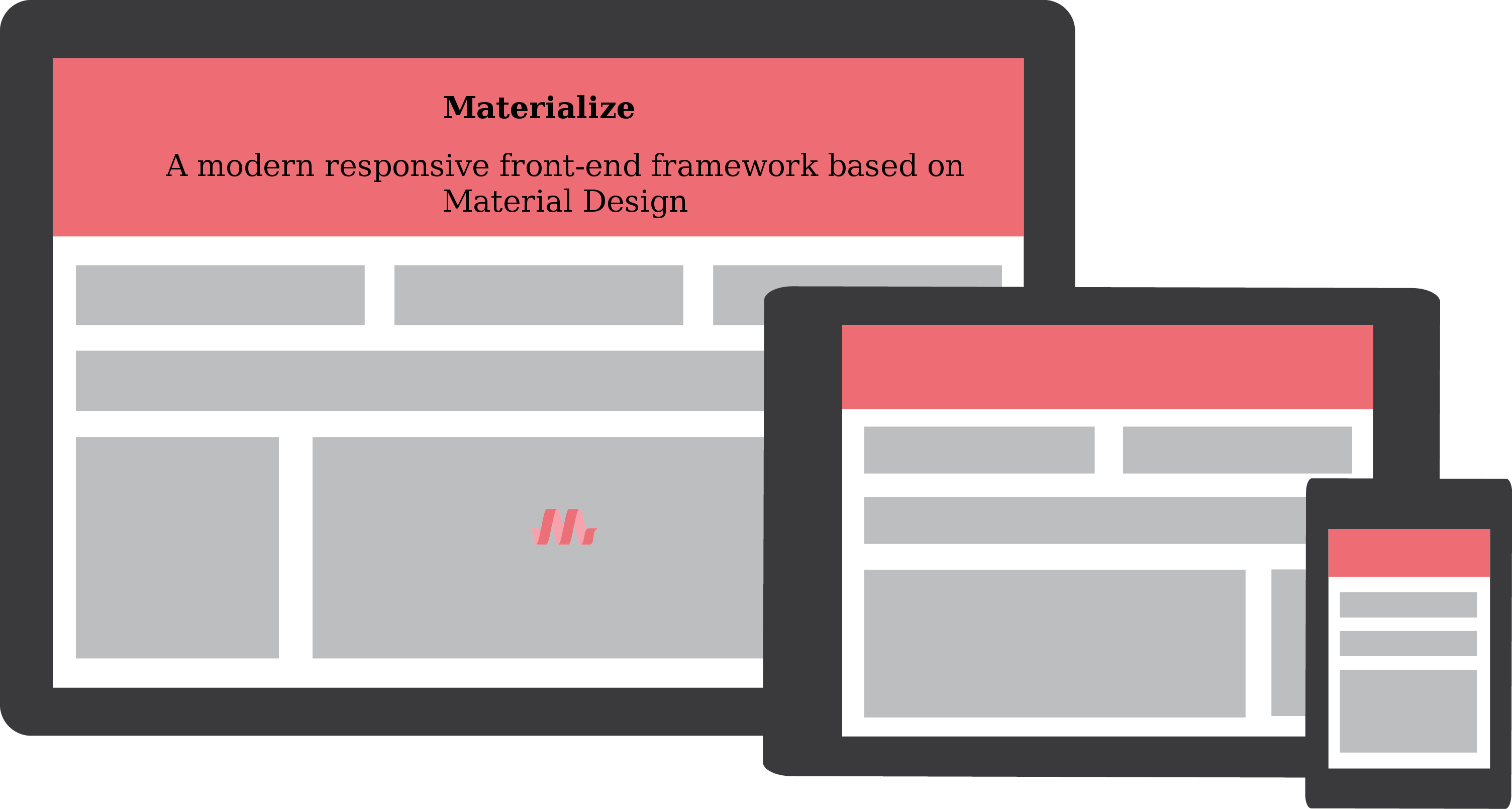
Materialize is a UI component library which is developed with CSS, JavaScript, and HTML, it's elements helps in building attractive, steady, stable, and functional web pages and web apps while following the practice and principle of modern web design like browser compatibility and portability, device compatibility, and graceful degradation. It helps website to be setuup faster, beautiful, and responsive. It is inspired from Google Material Design.
Supported Browsers:
Chrome 35+, Firefox 31+, Safari 7+, IE 10+For more details on setup visit <a href="http://materializecss.com/" target="_blank">here</a>.
HTML template:-
A basic HTML template using Materialize would look like this:-
<!DOCTYPE html>
<html>
   <head>
    <title>Materialize</title>
    <meta name="viewport" content="width=device-width, initial-scale=1">
    <link rel="stylesheet" href="https://fonts.googleapis.com/icon?family=Material+Icons">
    <link rel="stylesheet" href="https://cdnjs.cloudflare.com/ajax/libs/materialize/0.97.3/css/materialize.min.css">
    <script type="text/javascript" src="https://code.jquery.com/jquery-2.1.1.min.js"></script>
    <script src="https://cdnjs.cloudflare.com/ajax/libs/materialize/0.97.3/js/materialize.min.js"></script>
  </head>
  <body>
      <div class="card-panel teal lighten-2"><h3>Hello World!</h3></div>
   </body>
</html>
Key Features of Materialize
1. Sass Mixins:-
Materialize css framework conveys Sass Mixins which consequently includes all program prefixes when we compose certain CSS properties. It's an awesome component to need to guarantee similarity over all programs, with as meager complain, and code, as could be allowed.2. Flow Text:-
While other frontend frameworks utilize settled content, Materialize executes really responsive content. Content size and line tallness are additionally scaled responsively to look after decipherability. With regards to littler screens, the line stature is scaled bigger.
For example:-<p class="flow-text">This is Flow Text.</p>3. Ripple effect with Waves:-
Another feature of Material Design is that it involves interactive feedback, one notable example is the "ripple effect". In Materialize, this effect is called Waves. This effect apers when a users clicks or tab on a button or any other touch/clickable element. Waves can be easily created by adding waves-effect class onto your elements.For example:-
<a href="#" class="btn waves-effect">Submit</a>4. Shadow:-To deliver on this priniciple, materialize uses its z-depth-(number) class. In order to determine the shadow depth, you need to change the (number) from 1 to 5.
For example:-
<div class="card">
  <p>Shadow depth 3</p>
  <p class="z-depth-3"></p>
</div>
5. Buttons and Icons:-
There are three main button types of Materialize css: Raised button, Fab (floating action button) and Flat button.- (1) Raised Button:-
raised button is the default button first you have to create this button for that you have to add a btn class to your elements.For giving the wave effect when this button is clicked or pressed you can use below code:
<a href="#" class="btn waves-effect waves-light">Submit</a>- Floating Button:-
A floating button can be created by appending btn-floating class and your desired icon. For instance:
<a href="#" class="btn-floating waves-effect waves-light"> <i class="mdi-content-send"></i> </a>- Flat button:-
In Materialize css, the flat button is usually used within the dialog box. To create it, just add "btn-flat" to your element like the below example:
<a href="#" class="btn-flat waves-effect waves-red">Submit</a>For example how to use classes for grid system:-
<div class="row">
  <div class="col s12">12 columns are used for full width</div>
  <div class="col s4">4 columns is one-third of full width</div>
  <div class="col s3">3 columns is one-fourth of full width</div>
  <div class="col s2">2 columns is one-sixth of full width</div>
</div>
5. Skeleton

Skeleton CSS framework is one of the popular front end framework. It's just gives responsive CSS modules to HTML sites not js files.
Skeleton gird offers 12-column responsive liquid framework with a maximum width of 960px. It can change maximum width of page utilizing CSS code and all columns will resize accordingly.
For more details on setup visit here.
HTML template:-
A basic HTML template using Skeleton would look like this:-<!DOCTYPE html> <html lang="en"> <head> <meta charset="utf-8"> <title>Skeleton Framework</title> <meta name="viewport" content="width=device-width, initial-scale=1, maximum-scale=1"> <link rel="stylesheet" href="css/normalize.css"> <link rel="stylesheet" href="css/skeleton.css"> </head> <body> <!-- Primary Page Layout--> <div class="container"> <!-- columns should be the immediate child of a .row --> <div class="row"> <div class="one column">One Column</div> <div class="eleven columns">Eleven Column</div> </div> <!-- just use a number and class 'column' or 'columns' --> <div class="row"> <div class="two columns">Two Column</div> <div class="ten columns">Ten Column</div> </div> <!-- there are a few shorthand columns widths as well --> <div class="row"> <div class="one-third column">1/3 columns is one-third of full width</div> <div class="two-thirds column">2/3 columns is two-third of full width</div> </div> <div class="row"> <div class="one-half column">1/2 columns is one-half of full width</div> <div class="one-half column">1/2 columns is one-half of full width</div> </div> </div> <!-- End Document--> </body> </html>Hope you liked the post. Feel free share your Thoughts in comments below


 "Click to preview")
 "Click to preview")
 "Click to preview")
 "Click to preview")
 "Click to preview")
 "Click to preview")
0 Comment(s)