-
Material UI in WPF-Part 2
almost 10 years ago
Hi Friends,
In the previous part we’ve seen some Material controls and they look pretty impressive. You don’t have to put extra effort for styling standard controls and need a little effort for out of the box controls like sliders cards etc.
But we saw that our main window was still not matching with the Angular theme. Are we stuck here and do we need to work with those scary Win32 dlls for this? Definitely not because you have yet another library which transforms your window to a MetroWindow and with that you can create a unified UI which has a flat design.
So the MahApps Metro has its own impressive controls and it modifies the window too along with the controls unlike the WPF Material Design library, but including these two you can get a great UI. Of course you are free to use the controls in MahApps.Metro library if you don’t like the Material Design.
So open the Nuget Package Manager Console, enter following command and press enter:
Install-Package MahApps.MetroWhen the installation is finished Open the MainWindow.xaml (or your window whatever it is).
Copy any of the following references of MahApps Library in your Page:
xmlns:Controls="clr-namespace:MahApps.Metro.Controls;assembly=MahApps.Metro"
or
xmlns:Controls=http://metro.mahapps.com/winfx/xaml/controls
In case you have any confusion, take a look at following screenshot:
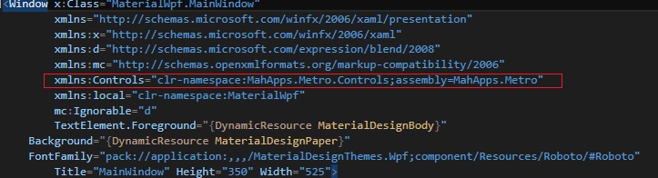
Now change the <Window x :Class..> section like following:
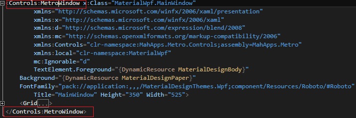
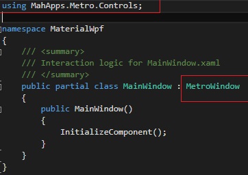
Now open the MainWindow.xaml.cs and change the “Window” class from which the MainWindow is inherited to “MetroWindow” and resolve the namespace. It will add a namespace for MahApps:
Now run the project and you’ll get a window like following:
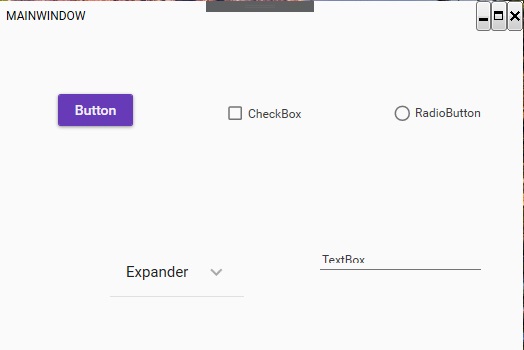
So it looks like we have done something but that’s not complete. There are Material Controls with slight flat UI of the window. That looks somewhat promising but not great. Issue is, the MahApps we just added and the Material we used in previous section are having a conflict .Solution? Just put the references? No.
Because when you put the references of MahApps Metro controls themes etc, the material references will be overshadowed. And if you remove the Mahapps references, you won’t get your window right. So the solution for using MahApps is also given in by Material Design for WPF github page (Yeah..you are right..by same “ButchersBoy” who was there in previous article.).
So there is nothing like, you are going to solve this conflict. There is another nuget package we have to install for themes and one modification for App.xaml. That’s it. So let us get to it. Install the following nuget package:
Install-Package MaterialDesignThemes.MahAppsIf you take a look at the name of the package, it is clear that it is the package of the Material Design themes for MahApps. After this is installed open the App.xaml and copy the following code inside <ResourceDictionary.MergedDictionaries/> section(Remove the previous references of Material design):
<!-- MahApps -->
                <ResourceDictionary Source="pack://application:,,,/MahApps.Metro;component/Styles/Controls.xaml" />
                <ResourceDictionary Source="pack://application:,,,/MahApps.Metro;component/Styles/Fonts.xaml" />
                <ResourceDictionary Source="pack://application:,,,/MahApps.Metro;component/Styles/Colors.xaml" />
                <ResourceDictionary Source="pack://application:,,,/MahApps.Metro;component/Styles/Accents/BaseLight.xaml" />

                <!-- Material Design -->
                <ResourceDictionary Source="pack://application:,,,/MaterialDesignThemes.Wpf;component/Themes/MaterialDesignTheme.Light.xaml" />
                <ResourceDictionary Source="pack://application:,,,/MaterialDesignThemes.Wpf;component/Themes/MaterialDesignTheme.Defaults.xaml" />
                <ResourceDictionary Source="pack://application:,,,/MaterialDesignColors;component/Themes/Recommended/Primary/MaterialDesignColor.DeepPurple.xaml" />
                <ResourceDictionary Source="pack://application:,,,/MaterialDesignColors;component/Themes/Recommended/Accent/MaterialDesignColor.Lime.xaml" />

                <!-- Material Design: MahApps Compatibility -->
                <ResourceDictionary Source="pack://application:,,,/MaterialDesignThemes.MahApps;component/Themes/MaterialDesignTheme.MahApps.Fonts.xaml" />
                <ResourceDictionary Source="pack://application:,,,/MaterialDesignThemes.MahApps;component/Themes/MaterialDesignTheme.MahApps.Flyout.xaml" />
What is that? Nice and simple. References for Mahapps, MaterialDesign and Compatibility.
Now come out of <ResourceDictionary.MergedDictionaries/> section and copy the following code outside:
<!-- MahApps Brushes -->
            <SolidColorBrush x:Key="HighlightBrush" Color="{DynamicResource Primary700}"/>
            <SolidColorBrush x:Key="AccentColorBrush" Color="{DynamicResource Primary500}"/>
            <SolidColorBrush x:Key="AccentColorBrush2" Color="{DynamicResource Primary400}"/>
            <SolidColorBrush x:Key="AccentColorBrush3" Color="{DynamicResource Primary300}"/>
            <SolidColorBrush x:Key="AccentColorBrush4" Color="{DynamicResource Primary200}"/>
            <SolidColorBrush x:Key="WindowTitleColorBrush" Color="{DynamicResource Primary700}"/>
            <SolidColorBrush x:Key="AccentSelectedColorBrush" Color="{DynamicResource Primary500Foreground}"/>
            <LinearGradientBrush x:Key="ProgressBrush" EndPoint="0.001,0.5" StartPoint="1.002,0.5">
                <GradientStop Color="{DynamicResource Primary700}" Offset="0"/>
                <GradientStop Color="{DynamicResource Primary300}" Offset="1"/>
            </LinearGradientBrush>
            <SolidColorBrush x:Key="CheckmarkFill" Color="{DynamicResource Primary500}"/>
            <SolidColorBrush x:Key="RightArrowFill" Color="{DynamicResource Primary500}"/>
            <SolidColorBrush x:Key="IdealForegroundColorBrush" Color="{DynamicResource Primary500Foreground}"/>
            <SolidColorBrush x:Key="IdealForegroundDisabledBrush" Color="{DynamicResource Primary500}" Opacity="0.4"/>
And you are done here.Find the above code and other details here:
What now? Run the project and your whole window looks great with material theme. Consider the following snapshot:
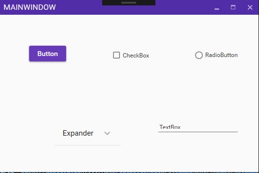
Looks great, right? Best part is even if you are using two different libraries and one glue library (That compatibility package which we just used), you don’t need to worry about any custom code. You can use your standard control or go to that GitHub code for extra controls and implement them as you wish.
So what else we can do here? Just trying to give you an idea. If we need a login button and you wish you could put it on Titlebar with a cool icon. I have seen it some apps and it looks great. How will you do that?
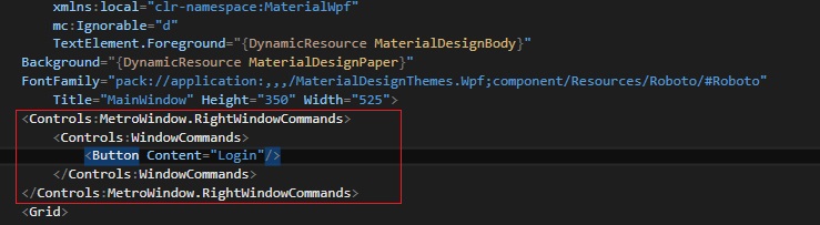
Come to your MainWindow.xaml and add following code just after the window properties and before the “Grid”:
<Controls:MetroWindow.RightWindowCommands>
        <Controls:WindowCommands>
            <Button Content="Login"/>
        </Controls:WindowCommands>
    </Controls:MetroWindow.RightWindowCommands>
In case you are not sure where to add it, take a look at following screenshot:
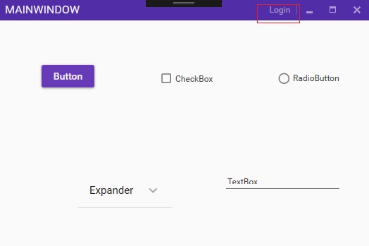
Now run the project and when you get the MainWindow, you get a “Login” button on the TitleBar like following:
We can add icons to the buttons also. For that there in another nugget package for resources is there. Install the following nugget package:
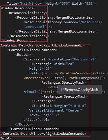
Install-Package MahApps.Metro.ResourcesWhen this package is installed in your solution you get thousands of icons for almost every scenario. So you have the resources, just add them as window resource (you can make it an application resource too), just before <Controls:MetroWindow.RightWindowCommands/> section and modify the <Controls:MetroWindow.RightWindowCommands> as following:
  <Window.Resources>
        <ResourceDictionary>
            <ResourceDictionary.MergedDictionaries>
                <ResourceDictionary Source="/Resources/Icons.xaml" />
            </ResourceDictionary.MergedDictionaries>
        </ResourceDictionary>
    </Window.Resources>
    <Controls:MetroWindow.RightWindowCommands>
        <Controls:WindowCommands>
            <Button>
                <StackPanel Orientation="Horizontal">
                    <Rectangle Width="20"
                   Height="20"
                   Fill="{Binding RelativeSource={RelativeSource AncestorType=Button}, Path=Foreground}">
                        <Rectangle.OpacityMask>
                            <VisualBrush Stretch="Fill" Visual="{StaticResource appbar_user}" />
                        </Rectangle.OpacityMask>
                    </Rectangle>
                    <TextBlock Margin="4 0 0 0"
                   VerticalAlignment="Center"
                   Text="Login" />
                </StackPanel>
            </Button>
        </Controls:WindowCommands>
    </Controls:MetroWindow.RightWindowCommands>
I am not going in the details of the XAML syntax used here but you can see that <VisualBrush Stretch="Fill" Visual="{StaticResource appbar_user}" />section is responsible for the icon and you can change the text for the butoon inside “Text” attribute.So the changed code looks like following:
Now the result looks like following:
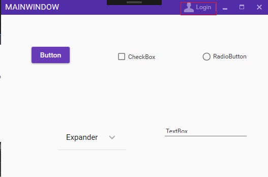
Now that looks pretty cool as a login button. You can extend the functionality as per your requirement or liking.
This is a long article but it goes step by step for creating a complete Material UI for your applications. So keep exploring the links and the Github repositories and try using other controls.Try playing around and implementing other UI ideas. With these libraries in your hand, possibilities are endless for creating a cool looking UI.
Thank You.
Happy Coding.:-)


 "Click to preview")
 "Click to preview")
 "Click to preview")
 "Click to preview")
 "Click to preview")
 "Click to preview")
 "Click to preview")
 "Click to preview")
 "Click to preview")
0 Comment(s)