-
Layout controls in Windows Phone 8.1
over 9 years ago
Layout controls are those controls which contain and position child controls on the screen. In other words we can say that such controls behave as layout container in our application. Whenever we need to achieve a certain level of complexity in the UI we can implement layout control inside another layout control.
We are going to read about following layout controls in this article.
- Grid
- StackPanel
- Canvas
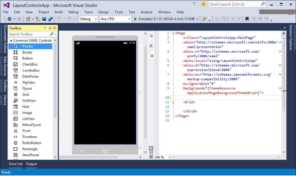
Creating a new projectOpen Visual Studio and create a new project with name "LayoutControlsApp". Select "Blank App (Windows App)" from the project type list and press "OK". Now let's open "MainPage.xaml" page from our application and you will be shown with the following screen.
GridThe Grid control is a layout panel which supports arranging controls in multiple rows and columns. It provides an area consists of rows and columns which provides space for child elements. In case we want our child control to span across multiple rows and columns, we use RowSpan and ColumnSpan attached properties.
Using Grid control basically consists of following steps.- Include Grid control in application.
- Specify Grid's Row and Column definitions by using Grid.RowDefinitions and Grid.ColumnDefinitions.
- Add child controls and position them in the specific cells of Grid by using Row and Column attached properties.
It's time to see practical implementation of the above steps one by one.
1. Include Grid control in application.
Let's open xaml code of "MainPage.xaml" page of our application, there must be a default Grid control provided there. If you want to start from scratch just remove Grid control defined by Grid tag which will look like as follows.
<Grid>

</Grid>
Having deleted the default Grid, you can either define it by writing Grid tag or open Toolbox and drag Grid control inside the Page tag.2. Specify Grid's Row and Column definitions by using Grid.RowDefinitions and Grid.ColumnDefinitions.
Now we have a Grid control available, so next step will be to specify the Rows and Columns inside it using Grid.RowDefinitions and Grid.ColumnDefinitions. Just paste or better type(as a good practice) the following xaml inside your Grid control.
<Grid.RowDefinitions>
    <RowDefinition/>
    <RowDefinition/>
    <RowDefinition/>
</Grid.RowDefinitions>

<Grid.ColumnDefinitions>
    <ColumnDefinition/>
    <ColumnDefinition/>
</Grid.ColumnDefinitions>
We have just added 3 rows using RowDefinition inside Grid.RowDefinitions and 2 columns inside Grid.ColumnDefinitions using ColumnDefinition.
3. Add child controls and position them in the specific cells of Grid by using Row and Column attached properties.
Now just after closing tag of Grid.ColumnDefinitions, we add child controls represented by the following xaml code.
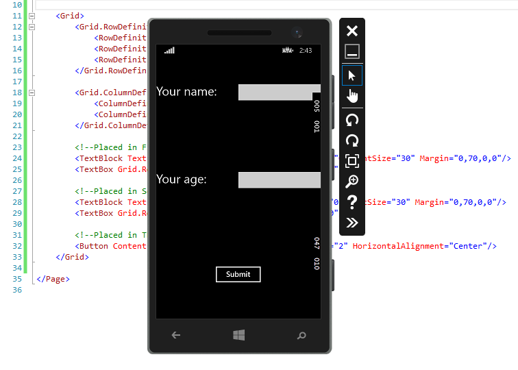
<!--Placed in First row-->
<TextBlock Text="Your name:" Grid.Row="0" Grid.Column="0" FontSize="30" Margin="0,70,0,0"/>
<TextBox Grid.Row="0" Grid.Column="1" Margin="0,70,0,0"/>

<!--Placed in Second row-->
<TextBlock Text="Your age:" Grid.Row="1" Grid.Column="0" FontSize="30" Margin="0,70,0,0"/>
<TextBox Grid.Row="1" Grid.Column="1" Margin="0,70,0,0"/>

<!--Placed in Third row but span across 2 columns-->
<Button Content="Submit" Grid.Row="2" Grid.ColumnSpan="2" HorizontalAlignment="Center"/>
In the preceding xaml, notice the usage Grid.Row and Grid.Column attached properties in the child controls above. The property Grid.Row specify the row and Grid.Column specify the column inside the parent Grid control.
In the Submit button we have used the Grid.ColumnSpan="2" to span button across 2 columns and property HorizontalAlignment is set centered to show it in the middle of the third row.
The final xaml code will product output like shown below.
StackPanel
StackPanel is a simple layout control which supports arranging child elements in a single line which could be set horizontally and vertically. The alignment of child elements could be defined using Orientation property which is set to Vertical be default.
If you are using the same application to check all layout controls and have implented Grid discussed above, please comment Grid control and paste the following xaml code for StackPanel.
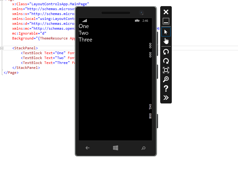
<StackPanel>
	<TextBlock Text="One" FontSize="30"/>
	<TextBlock Text="Two" FontSize="30"/>
	<TextBlock Text="Three" FontSize="30"/>
</StackPanel>
The above xaml will produce following output.
Canvas
Canvas defines the surface to position the child elements explicitly by defining the coordinates relative to the Canvas area. Position coordinates of the child elements are specified using x and y coordinates. The x and y coordinates are defined using Canvas.Left and Canvas.Top.
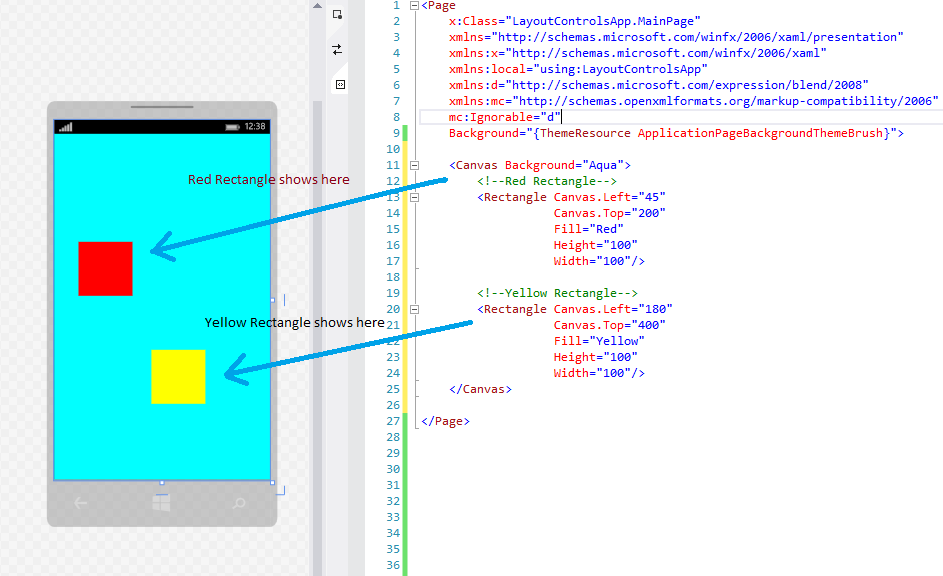
<Canvas Background="Aqua">
	<!--Red Rectangle-->
	<Rectangle Canvas.Left="45"
			   Canvas.Top="200"
			   Fill="Red"
			   Height="100"
			   Width="100"/>

	<!--Yellow Rectangle-->
	<Rectangle Canvas.Left="180"
			   Canvas.Top="400"
			   Fill="Yellow"
			   Height="100"
			   Width="100"/>
</Canvas>
In the preceding xaml, we have a Canvas control with two child Rectangle controls, one with the Red background and another with Yellow background. Both child Rectangle controls have x coordinate set using Canvas.Left and y coordinate set using Canvas.Top.
For the first Rectangle we have coordinates defined as
Canvas.Left="45"
Canvas.Top="200"
and for the second Rectangle we have coordinates defined as
Canvas.Left="180"
Canvas.Top="400"The above xaml will produce the output as shown below.


 "Click to preview")
 "Click to preview")
 "Click to preview")
 "Click to preview")
 "Click to preview")
0 Comment(s)