-
How to create SEO friendly responsive web page in HTML5
over 10 years ago
Hi Guy,
In this Blog, We will discuss about how to make a SEO friendly web page with the help of HTML5 and CSS. Note that for making this tutorial simple, we only consider the aspect of making a web page not whole website.
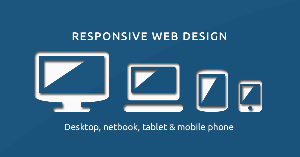
What is responsive Web page ? A responsive web page is page which can fit in various resolution and size devices like mobile, large computers, laptops, palmtops and smart phone. A responsive design looks nice on any size of device. It uses CSS andHTML5 to scale page according to the users device.Below is Code for responsive Webpage
<!DOCTYPE html>
<html lang="en-us">
<head>
<meta charset="UTF-8"> //set the charset to UTF-8.
<meta name="viewport" content="width=device-width, initial-scale=1.0"/> // Set the Viewport according to device

<style>
.city {
    float: left;
    margin: 5px;
    padding: 15px;
    width: 300px;
    height: 300px;
    border: 1px solid black;
}
</style>
</head>
<body>

<h1>Test: Responsive Web Page</h1>

<div class="city">
  <h2>Dehradun</h2>
  <p>Dehradun is the capital Uttarakhand.</p>
  <p>It is the most popular city of Uttarakhand, surrounded by the various type of hills
.</p>
</div>

<div class="city">
  <h2>Haridwar</h2>
  <p>On of the religious city of India.</p>
  <p>The Haridwar city famous for Holy river Ganga and many temple situated nearby this river.</p>
</div>

<div class="city">
  <h2>Chandigarh</h2>
  <p>Chandigarh is the union territory of India and is the capital of two states Punjab and Haryana.</p>
  <p>It is the center of the two states Area,
  and the most planed metropolitan area in India.</p>
</div>

</body>
</html>
In the above code the two main SEO components are present apart from regular meta tags one is meta charset which is tell the browser about encoding of website and most important viewport meta tag which tell how the web page should be displayed on a machine. the explanation og viewport tag have two parameter on is width=device-width that means content should be resize according to the device and second on 1 i.e default zoom size set to 1, which means your web page should displayed size is 100%.
Conclusion:
In the present era when most of internet website are open from mobile devices and also some are using old large desktops, so it is important to make our web page responsive. Hope you enjoy reading this blog.


0 Comment(s)