Without a doubt, the modern internet contains tons of visually pleasing online projects. Some of them are extremely popular when others are not so attractive. Still, the fact is that every business type already has its variety of eCommerce websites.
All in all, it is the most advantageous business model today. Thus, we can tell you that there is no company, which doesn’t need its site. Even all the big players are using it to develop their companies. So, why some of these websites have a huge audience when others do not?
To say more, how to create the site, which will further the development of your deal? Given these points, we made a small investigation for you. To make a long story short, in this post we will tell you how to improve your customer experience with website design.
Start with Comfort
Needless to say, it is all about comfort. Thus, no matter what your website is about, it should be comfortable for your prospects. At the outset, make sure that you have a highly responsive design. This small point will make your eCommerce website always look classy and professional. People will be able to enter it via any gadget with any screen size. As a result, there will be no limits on time or location. Actually, today 100% responsive design is #1 for any business project. That is why all the eCommerce templates already have it in their packages.

Your FrontPage
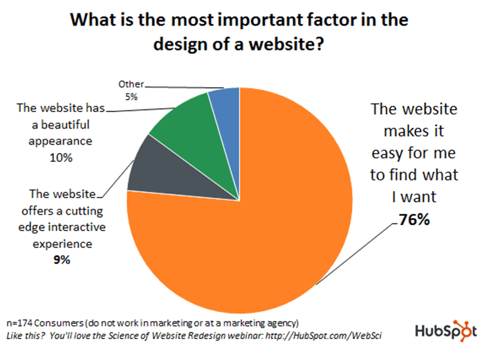
The investigations showed that there are less than 10 seconds to grab the attention of an online user. What is the first thing a shopper sees when opening your eCommerce website? Yep, it is homepage! Therefore, it should be qualitative enough to keep a visitor engaged. What should you do?
- Firstly, keep your main page clean. Do not overuse various small design elements.
- Secondly, use a properly chosen color palette to create an eye-friendly contrast. It will help you to highlight the needed information.
- Thirdly, don’t forget to create a unique logo. Show it on the top of your homepage. It will make your brand more recognizable.
- Fourthly, remember about F-pattern. Beforehand, shoppers will scan your visual content in a horizontal movement. They usually take a look at the upper part of your eCommerce site, left to right. Next, your prospects will scan the vertical part of a content area. The eyes of your customers go down and stop only when a person noticed an interesting point. Then they read left to right again. This simple rule shows how to place your content in the most beneficial way.
- Fifthly, don’t forget about the beautiful side of the question. Use readable fonts, high-quality photography, visual effects, etc. Also, we recommend you to enrich your homepage with call-to-action buttons.
Navigation
As soon as the shopper decided that they stay on your site, they will want to view out its products. Obviously, one can simply open the gallery… Still, now your main task is to help people wind that they are looking for. How to improve your customer experience?

- To start with, sort your goods. Create multiple products categories and subcategories.
- Secondly, create different search options. Let prospects search by sizes, brands, colors, prices, etc.
- What is more, you will need Live Search. In a word, it shows the search results while a user is typing the request. In the end, people will also see other popular items.
- In addition, we recommend you to connect your products. For example, a shopper is viewing a particular item that he/ she doesn’t want to buy. Still, they may want to get an older or a newer model. Thus, internal linking will be helpful.

What Else?
Actually, comfortable navigation is not only about the products you sell. All the other options and pages should be easy to find as well. Here are several tips that will help to improve your customer experience.

- Create the attention-grabbing banners for sales, discounts and other upcoming events. Have some new arrivals? In this case, don’t forget to tell people about it. Furthermore, these banners should be clickable. Redirect them to the categories or products in question.
- Another important moment is your gallery. Add the filters and keywords, so shoppers will easily find the needed items. We also suggest you create a modern gallery feed right on your homepage.
- The same thing is about your blog. Let your prospect find it without trouble. Place the recent posts and the most popular ones on your main page.
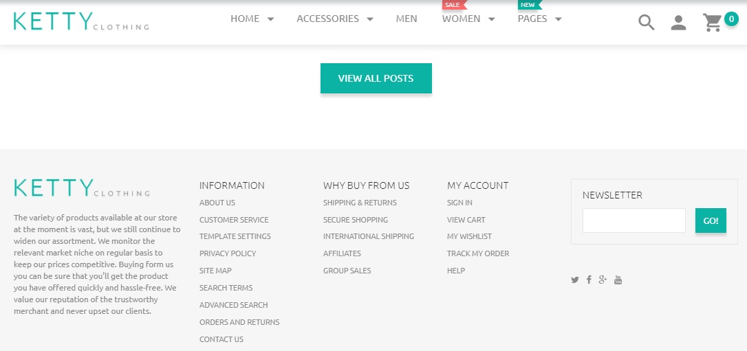
- To say more, don’t forget about contacts and shipping information. Let it be in the header and footer of your eCommerce website.
- Without a doubt, your web shop should be a trustworthy one to improve your customer experience. For these simple reasons, we recommend you to add such features as live chat and quick contact form. With it, online users will be able to contact you directly.
- Next, create a relevant FAQ page. Make it visible in the menu of your online shop. As a result, its visitors will find the answers to the most popular questions easily.
- Finally, let’s move to the icons. We recommend you to create cute icons for such usable pages as cart, wishlist or compare. Place them under each of your products and on the top of your pages.
- To finish with, we suggest you get a stylish stick-to-top menu. With its help, the guests will see all the options no matter which page they are viewing.

Search Engines Optimization
Undeniably, SEO is the first thing you should remember about if you want to improve your customer experience. In fact, there are some design elements that will help you to get better results from search engines. They are:
- MegaMenu;
- Blog or Gallery roll;
- Lazy Load effect;
- Tags;
- High-quality images for Google’s ‘Search by image’ functionality, and more.
As you can see, today improving your customer experience is as easy as pie. Therefore, don’t hesitate! Express yourself and create an inimitable design for your eCommerce website that will be memorable for any shopper.
0 Comment(s)