1. USERS
Your basic motto should always be your users. Always keep in mind that what is suitable for them. Also, reading about the guideline for IOS and ANDROID interface is not a bad idea.

2. COLOR MANAGEMENT
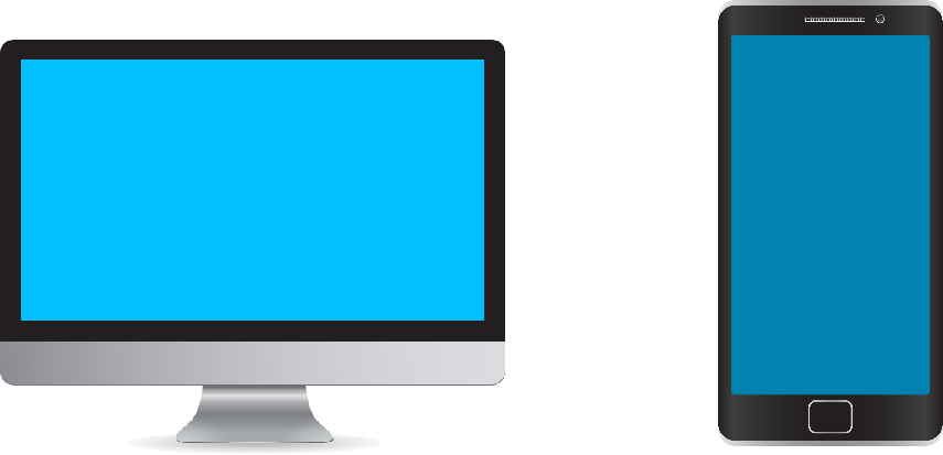
While designing the app we should keep in mind that the colors on screen in Photoshop and in saved files what's displayed in mobile should be matched. Color management makes lot of sense. It's much better to test your app design in different mobile devices.

3. ALIGNMENT & SPACING
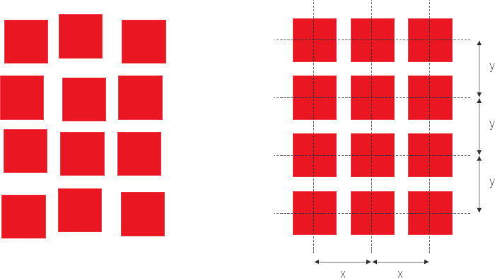
Alignment of objects in multiple screens is very important. In your app please make sure that the alignment and spacing are right. Placement of common objects like menu icon, Back button, Tittle bar, Footer should be same throughout the app. The best way to avoid the objects jumping around the screens is to set up a grid.

4. TYPOGRAPHY
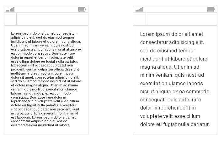
Typography is the most important ingredient of designing your app. Typography is often overlooked in digital media but since most information is conveyed through text, Keep in mind that your text is easy to read spaces between lines and words should be proper.

5. TAKE A BREAK
Sometimes we know there's a better way to do things, so let's take a break. It is easy to get completely consumed in the design but sometimes it pays to take a break. for example wander somewhere or go out for few minutes.
0 Comment(s)