The best way of representing a data set for analysis is using charts. So if you are developing a rails application and you want to show the analytics as charts in the dashboard, there are multiple gems available in the rubygems community. Here I am going to tell you how you can integrate charts using fusioncharts-rails gem, which is a rails wrapper for Fusion Chart.
To integrate the fusion chart, first you need to add the gem to your Gemfile
gem 'fusioncharts-rails'
Now run the bundle:
bundle
Now to understand it more clearly here I am taking an example that represents the comparison of visits of the sites for the last two months. Again we will begin with the setup of the application.
In the next step you need to download the required js files from http://www.fusioncharts.com/download/ and after extracting the zip file copy the entire javascript files and paste it to vendor/assets/javascripts/fusioncharts/.
Include the javascripts in your app/assets/javascripts/application.js
   //= require fusioncharts/fusioncharts
   //= require fusioncharts/fusioncharts.charts
   //= require fusioncharts/themes/fusioncharts.theme.fint
After you are done with including the js files of fusion chart, you need to create the object that will be passed to the view for creating the fusion chart. As in our case I am storing the per week view for the last two months for which I am creating the comparisons.
class WelcomeController < ApplicationController
  def index
  	@chart_data = Fusioncharts::Chart.new({
        width: "500", # For width of the chart
        height: "300", # For height of the chart
        type: "mscolumn2d", # type of chart
        renderAt: "chartHolder", #name of the div in which chart will be rendered
        dataSource: {
            chart: {
            caption: "Comparison between weekly views of chart",
            xAxisname: "Week",
            yAxisName: "Views (Users)",
            numberPrefix: "visits",
            theme: "fint", # theme of fusion chart
            exportEnabled: "1", # whether it can be exported or not
            },
            categories: [{
                    category: [
                        { label: "Week1" },
                        { label: "Week2" },
                        { label: "Week3" },
                        { label: "Week4" }
                    ]
                }],
                dataset: [
                    {
                        seriesname: "Last Month",
                        data: [
                            { value: "500" },
                            { value: "600" },
                            { value: "700" },
                            { value: "800" }
                        ]
                    },
                    {
                        seriesname: "This Month",
                        data: [
                            { value: "250" },
                            { value: "750" },
                            { value: "400" },
                            { value: "100" }
                        ]
                    }
              ]
		        }
		    })
   end
end
At last in the view, you need to render the chart like:
<%= @chart_data.render() %>
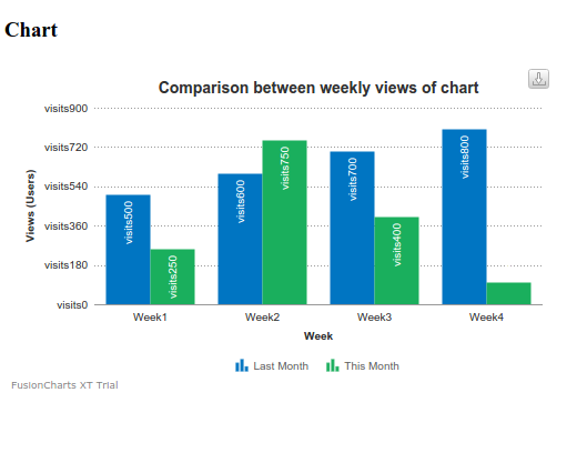
Now if you run the application the chart created will look something like this:

There are so many customizatiion available in fusionchart. For more details you can go through http://www.fusioncharts.com/
0 Comment(s)