-
The State of CSS Reflections
almost 9 years ago
Hello Everyone
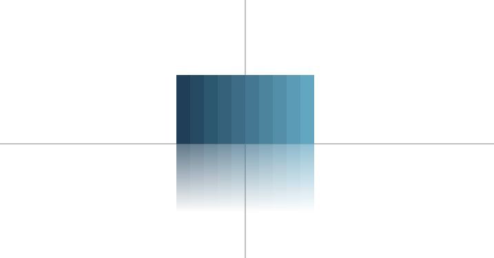
The reflection is mirror image of the image. In the css we can done it by the help of the css properties. In this we are going to use the position properties,transfer properties,linear gradient offset and direction. Here is an example of the reflection.
Steps:-1.Create 10 bars.
2.Position all these elements absolutely starting from the middle of the viewport.
3.Positioning the bars:-
We need to position them such that the left and right edge of the fist one and right one are at equal distance from the vertical line dividing the viewport into two equal halves.
4.Shading the bars.
5. Options for the reflection:-
for reflection we use
-webkit-box-reflect.it contains 3 parts:
- Directions(Below,left,above,right)
- Offset(which specifies how far from the edge of the element the reflection should start)
- Mask(an optional image)
Here is the code:
div class="loader">
  <div class="bar"></div>
  <div class="bar"></div>
  <div class="bar"></div>
  <div class="bar"></div>
  <div class="bar"></div>
  <div class="bar"></div>
  <div class="bar"></div>
  <div class="bar"></div>
  <div class="bar"></div>
  <div class="bar"></div>
</div>

<div class="loader loader--reflect">
  <div class="bar"></div>
  <div class="bar"></div>
  <div class="bar"></div>
  <div class="bar"></div>
  <div class="bar"></div>
  <div class="bar"></div>
  <div class="bar"></div>
  <div class="bar"></div>
  <div class="bar"></div>
  <div class="bar"></div>
</div>
css:
body {
  text-align: center;
  background-color: #eee;
}

* {
  -webkit-box-sizing: border-box;
     -moz-box-sizing: border-box;
          box-sizing: border-box;
}


/* The loader container */
.loader {
  position: absolute;
  top: 50%;
  left: 50%;

  width: 200px;
  height: 100px;

  margin-top: -100px;
  margin-left: -100px;

  perspective: 1000px;
  transform-style: preserv3d;
}

.loader--reflect {
  margin-top: 0;
}

.loader--reflect:after {
  content: '';
  position: absolute;
  top: 0;
  left: -25%;

  width: 150%;
  height: 110%;

  background: linear-gradient(0deg, rgba(238, 238, 238, 1), rgba(238, 238, 238, 1) 20%, rgba(238, 238, 238, 0.3));
}


/* The bar */
.bar {
  position: absolute;
  bottom: 0;
  left: 0;

  width: 20px;
  height: 100px;

  background-color: #1e3f57;

  transform: scaleY(0);
  transform-style: preserve3d;

  animation: bar 3s cubic-bezier(.81,.04,.4,.7) infinite;
}

.bar:nth-child(2) {
  left: 20px;

  background-color: #264a63;

  animation-delay: 50ms;
}

.bar:nth-child(3) {
  left: 40px;

  background-color: #2d566f;

  animation-delay: 100ms;
}

.bar:nth-child(4) {
  left: 60px;

  background-color: #35617a;

  animation-delay: 150ms;
}

.bar:nth-child(5) {
  left: 80px;

  background-color: #3d6d86;

  animation-delay: 200ms;
}

.bar:nth-child(6) {
  left: 100px;

  background-color: #447892;

  animation-delay: 250ms;
}

.bar:nth-child(7) {
  left: 120px;

  background-color: #4c849e;

  animation-delay: 300ms;
}

.bar:nth-child(8) {
  left: 140px;

  background-color: #548fa9;

  animation-delay: 350ms;
}

.bar:nth-child(9) {
  left: 160px;

  background-color: #5c9bb5;

  animation-delay: 400ms;
}

.bar:nth-child(10) {
  left: 180px;

  background-color: #63a6c1;

  animation-delay: 450ms;
}

.loader--reflect .bar {
  animation-name: bar-reflect;
}

@keyframes bar {
  0% {
    transform: rotateZ(-180deg) rotateX(-360deg);
  }
  75%,100% {
    transform: rotateZ(0) rotateX(0);
  }
}

@keyframes bar-reflect {
  0% {
    transform: rotateZ(180deg) rotateX(360deg);
  }
  75%,100% {
    transform: rotateZ(0) rotateX(0);
  }
}
Output:


 "Click to preview")
0 Comment(s)