-
Cubic-bezier function
over 8 years ago
Cubic-bezier curve is alike a parametric curve which is used in computer graphics and many other related fields. In animation, Bezier curves are used to smoothen the cursor orbit within the user interface design. Cubic-bezier curve is defined by the four points, namely P0, P1, P2 and P3 in the plane or any other high-dimension space. P0 is the starting point form where the curve starts moving towards point P1 and at last arrives at point P3. However P1 and P2 are just to provide the directional information. In CSS3 Transition we have some predefined timing functions, they are “ease”, “ease-in”, “ease-out”, “ease-in-out”, “linear”. With the help of cubic-bezier function we can create a custom speed for animation.
Thus, in CSS3 Transition, the syntax for cubic-bezier function is :
cubic-bezier( P0, P1, P2, P3 );
Value for each point in this curve ranges from 0 to 1. Let's check the equivalent cubic-bezier values for the above mentioned timing functions.
ease: default timing function and its equivalent cubic-bezier value is:
cubic-bezier( 0.25, 0.1, 0.25, 1 );
linear: stabilize the speed from start to end and its equivalent cubic-bezier value is:
cubic-bezier( 0, 0, 1, 1 );
ease-in: With this timing function the speed of animation will be slow at the time of beginning and will get acceleration and stabilize till the end.
cubic-bezier( 0.42, 0.0, 1.0, 1.0 );
ease-out: It is opposite to ease-in. The animation speed will be steady and fast in beginning and when the end is nearer it will slow down at that duration.
cubic-bezier( 0.0, 0.0, 0.58, 1.0 );
ease-in-out: It is a combination of both ease-in and ease-out functions. The animation will begin and ends slowly but in between beginning and end it will get accelerated.
cubic-bezier( 0.42, 0.0, 0.58, 1.0 );
Creating custom speed for animation with cubic-bezier has the only drawback that the values are not that instinctive. Therefore, there is a tool that can be helpful to get the required values.
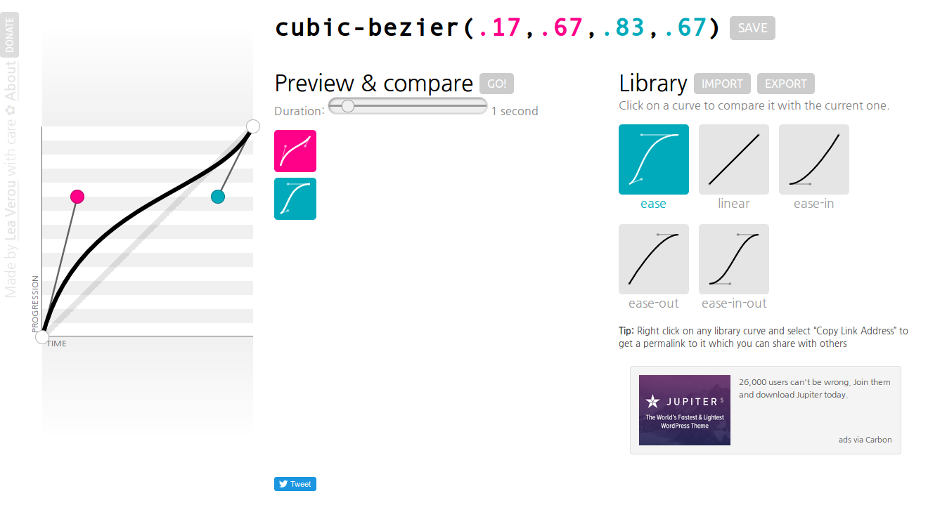
Click here to go to that tool.
Happy Coding :)


0 Comment(s)