-
Angular Material Md-Input
over 7 years ago
In angular material,we use a directive <md-input-container> to contain inputs. As the directive name implies,It is a container which contain input components like label,input and textarea as a child element. Using this container we can do error handling. For error handling there is a directive given:ng-message. Using this directive we can display any type of error message as required.
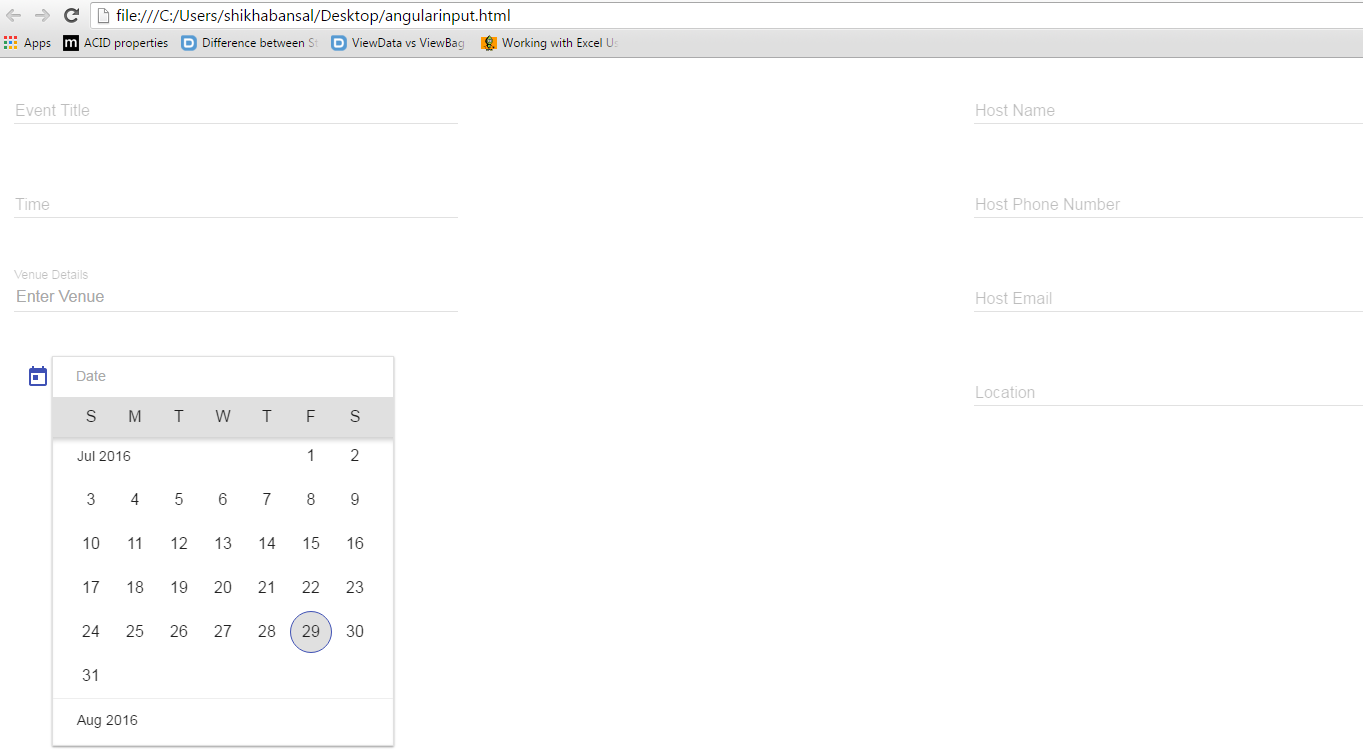
So to understand that how to use md-input-container directive we will see an example. In the example I have used label,input,textarea and datepicker control. As it is an EventInviteeForm so fields are added accordingly what is required. Here I have used <md-content> directive as it is a container which handles the scroll on webpage according to the page height so its better to have all the elements under md-content.
Here are some attributes which can be used with input components to have better UI and functionality in input controls.
Attributes are:
1.md-maxlength
md-maxlength defines the maximum length of an input control. We can set any limit to number of characters we want to insert in our input control. It will show a counter near the input which tells how many number of characters have been written and how many are left.
2.aria-label
we can set aria-label to our input control,if no label will be defined then this attribute will log a warning message in the console.
3. placeholder
Placeholder is the same as we use in html. It will hold a value for the input control if the label is not present to make rich input control.
4.md-no-autogrow
As the name implies,it will not allowed input controls to grow automatically. When it is used,input control like textarea will not grow automatically. We have to define limit to grow that input control.See the example:
<html lang="en" >
   <head>
      <link rel="stylesheet" href="http://ajax.googleapis.com/ajax/libs/angular_material/1.0.0/angular-material.min.css">
      <script src="http://ajax.googleapis.com/ajax/libs/angularjs/1.4.8/angular.min.js"></script>
      <script src="http://ajax.googleapis.com/ajax/libs/angularjs/1.4.8/angular-animate.min.js"></script>
      <script src="http://ajax.googleapis.com/ajax/libs/angularjs/1.4.8/angular-aria.min.js"></script>
      <script src="http://ajax.googleapis.com/ajax/libs/angularjs/1.4.8/angular-messages.min.js"></script>
      <script src="http://ajax.googleapis.com/ajax/libs/angular_material/1.0.0/angular-material.min.js"></script>
	  <link rel="stylesheet" href="https://fonts.googleapis.com/icon?family=Material+Icons">
	  <style>

      </style>
      <script language="javascript">
         angular
            .module('myapp', ['ngMaterial'])
            .controller('firstController', firstController);

         function firstController ($scope) {

         }
      </script>
   </head>
   <body ng-app="myapp">
      <div id="inputContainer" class="inputDemo" ng-controller="firstController as ctrl" ng-cloak>
       <md-content layout="row" flex="100" >
    <div class="md-padding" layout="column" flex="25">
        <md-input-container>
            <label>Event Title</label>
            <input ng-model="Title">
        </md-input-container>
        <md-input-container>
            <label>Time</label>
            <input ng-model="Time">
        </md-input-container>
      <md-input-container>
            <label>Venue Details</label>
            <input placeholder="Enter Venue" ng-model="Venue">
        </md-input-container>
		<md-content>
            <md-datepicker ng-model="MyDate" md-placeholder="Date"></md-datepicker>
        </md-content>
     </div>
    <div class="md-padding" layout="column" flex="25">
    </div>
    <div layout="column" flex="25" class="md-padding">
        <md-input-container>
            <label>Host Name</label>
            <input ng-model="HostName">
        </md-input-container>
        <md-input-container>
            <label>Host Phone Number</label>
            <input ng-model="PhoneNumber">
        </md-input-container>

        <md-input-container>
            <label>Host Email</label>
            <input ng-model="Email">
        </md-input-container>
        <md-input-container>
            <label>Location</label>
            <input ng-model="Location">
        </md-input-container>
    </div>
</md-content>
</div>
   </body>
</html>
Run your application and see the result in the browser: Refer Screenshot for reference


-
over 7 years ago
Following code throws in Chrome console: ARIA: Attribute " aria-label ", required for accessibility, is missing...
<label for="date-range-selector-from">From</label>
<md-input-container>
<input type="text" id="date-range-selector-from" aria-invalid="false" />
...
</md-input-container>
Why is it throwing this warning when there is label asociated with input? Shouldn't be aria-label needed when visible label cannot be shown on the page? I just want to have very ordinary label shown within input, no special effects. Thats why I put it outside md-input container. It should be ARIA compatible when I set attribute "for" and link it with id of the input.
-

1 Comment(s)